AVA SKINCARE
Category Branding & Packaging
PROGRAMS ADOBE ILLUSTRATOR, PHOTOSHOP
TypefaceS Majesti Banner, Fira Sans
Keywords Modern, Chic, Duality
—
Overview
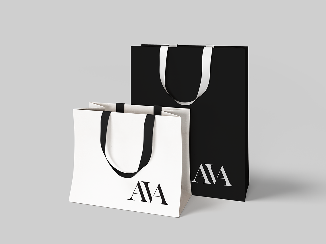
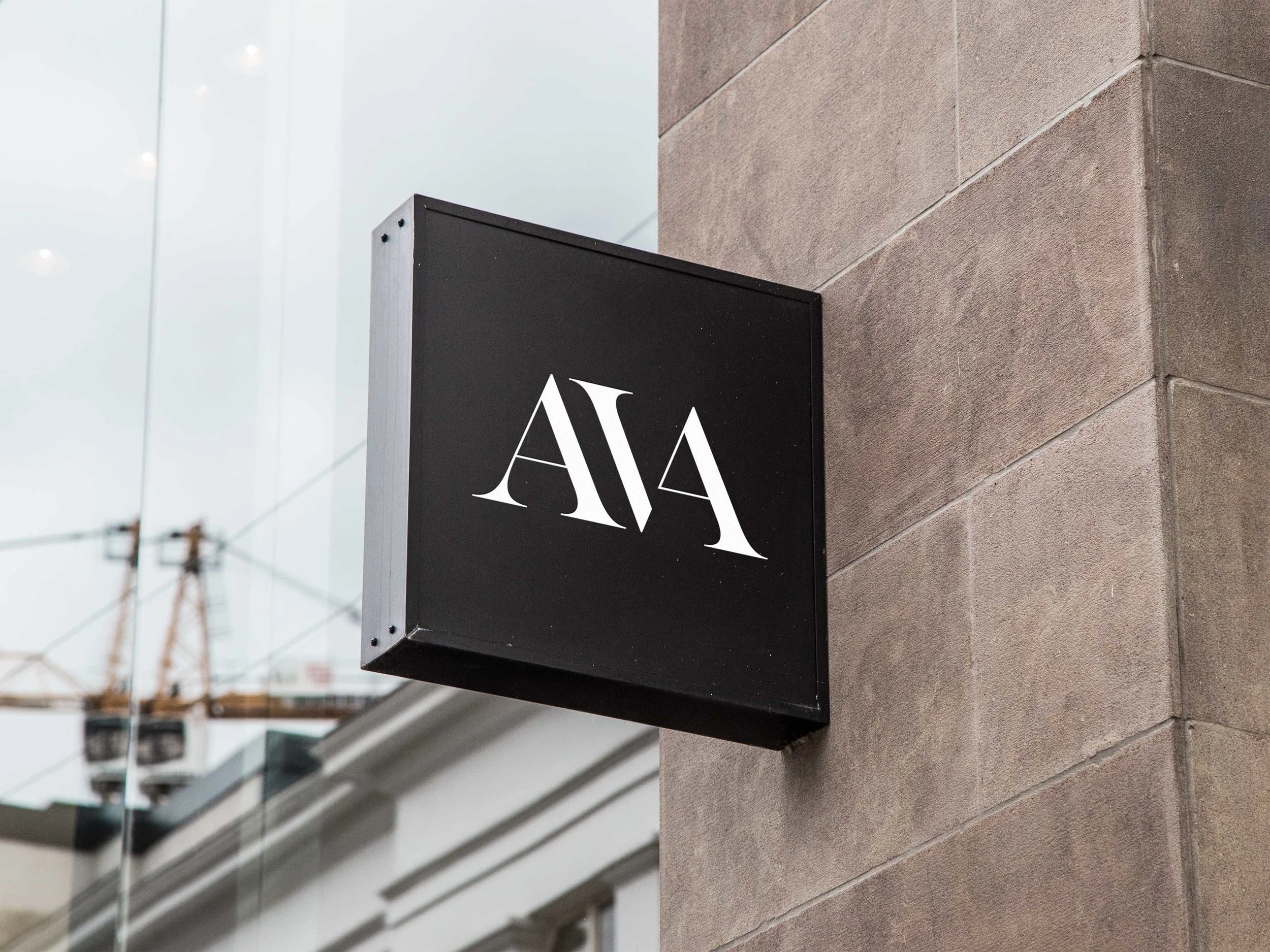
The objective was to create a high-end organic skin care brand that is based on the concept of duality. The name derives from the female character in the story of Adam & Eve, Ava is a stem of Eve, meaning life. Ava organic skin care caters to upper-class women, ages 15-35.
SOLUTION
To convey the brand, I focused on creating an elegant logotype that connects opposing letter forms to showcase the duality between the product and common audience associated with the market. The brand utilizes a sophisticated black and white palette to illustrate the duality the brand wants to showcase in order to differentiate from existing organic skin care brands. I utilized a sophisticated banner font for the logotype and a sans serif typeface for subheads to put emphasis on the brand and the concept.