ARCANE COFFEE COMPANY
Category Branding
PROGRAMS ADOBE ILLUSTRATOR, PHOTOSHOP
Typeface Disturbance, Plantin Std
Keywords MYSTICAL, Classical, Utilitarian
—
Overview
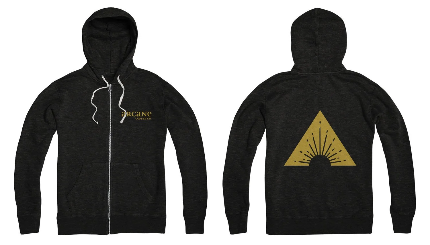
The primary objective when branding Arcane Coffee Co. was to create a design that is both classic and minimal, heavily influenced by fantasy board & card games. At the same time, I aimed to differentiate this brand from other mystical and fantasy-themed shops and venues that can be found scattered across the United States by ensuring that the design remains clean, sophisticated, and modern. Arcane Coffee Co. specifically caters to a diverse audience of men and women, primarily aged 18 to 30, who are passionate tabletop gamers, dedicated coffee enthusiasts, and busy college students seeking a unique place to unwind and enjoy their favorite brews.
SOLUTION
When designing the coffee bar, I meticulously crafted a sleek yet somewhat clandestine symbol that would elegantly adorn the coffee shop and all its associated products. The brand effectively utilizes an utilitarian aesthetic by artfully blending the archaic elements with the modern sensibilities of today's design trends. The main inspiration for this design stems from the intricate mystical symbols and the rising sun, often portrayed in medieval imagery and woodcuts. Through this thoughtful approach, I created a symbol that thoughtfully incorporates the first letter from the name of the coffee bar, making it distinct and memorable. Additionally, the brand employs a visually appealing Roman and medieval serif typeface for the logo, further enhancing its unique character.